Bad design stops people reading your copy. No matter how good your writing is, it will not engage people if it isn’t presented in the right way.
When was the last time you opened a website only to click off once you saw how bad the layout was?
This is how your readers feel if the design isn’t right. And it isn’t just a small consideration for your potential readers but one of the main factors in deciding whether they will consume your content.
For B2B copywriting specifically, this can be especially challenging. For every asset – whether it be an article, report, graphic, presentation, video, etc. – there is a lot of information to fit in there. Trying to pack all this information into a fixed amount of space can lead to some very dense (and ugly) results.
When this happens, your copy is falling at the first hurdle. People don’t read it and whatever content objectives you had go out the window. So how can you ensure that your design is living up to your copy?
How do I know if my design is bad?
Bad design generally causes two problems.
The first is that it makes your copy confusing to read. People open it, don’t know where to start reading, and then the copy doesn’t make any sense. Whatever carefully crafted storylines or flows you’ve weaved into your writing are undone as readers navigate through the asset in the wrong way.
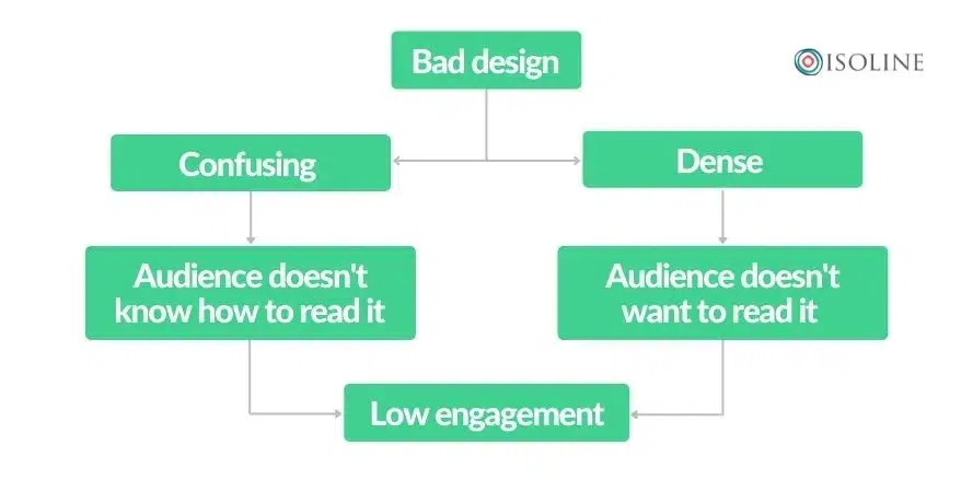
The second challenge is that it’s too dense. If there’s too much information shown at once, readers see it as too much of a time investment. At best, they read it but struggle to remember everything. At worst, they decide to invest that time reading something else.
What do readers want?
Good design can be obvious; you will have seen copy and thought “that looks great!”. But good design can often be invisible as well. It’s ultimately meant to help the reader digest your copy in the easiest way possible. Ideally, it should be so easy that they aren’t even conscious you’re helping them.
Here are a few suggestions on how you can help your readers out.
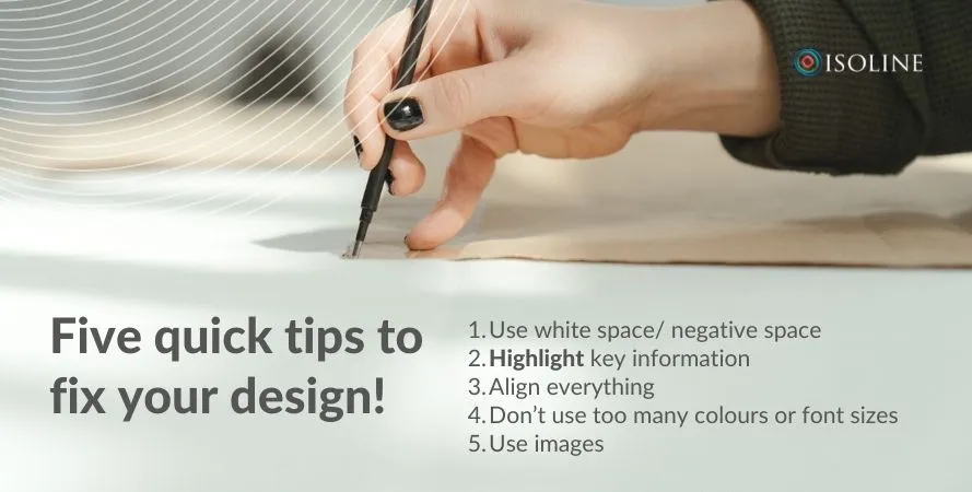
- Use white space/ negative space – Give everything room to breathe and help readers follow the story in your copy. By creating the right space between lines, paragraphs, columns, etc, readers will better understand where they should start reading.
- Highlight key information – You can do this with text boxes or different font sizes and colours. Though you should do this sparingly. When you highlight everything, you highlight nothing.
- Align everything – Nothing will irk your readers more than when everything is misaligned. It looks amateur and will make people question the integrity of your copy.
- Don’t use too many colours or font sizes – It can be visually confusing. It’s also ugly most of the time. This can also become a problem when you’re trying to maintain consistent brand guidelines.
- Use images – They can break up your text and help reinforce key ideas and themes in the adjacent copy. Pick images that are the same style to create a more consistent feel across your assets.
Write and design at the same time!
The best way to ensure that your design is a good fit for your copy is to develop them together. By starting with a layout or template, you can develop copy quickly without having to rush the design at the last minute.
This is especially useful if you already have a design that you know works. After all, there’s no need to come up with new designs without good cause. If you don’t have a template, however, you can still plan the layout before you start. Even if it’s a quick sketch, knowing where everything goes helps you write copy that is fit for purpose.
Good design fulfils the potential of your copy
Don’t let design be an afterthought to your copy. Now that you’ve spent the time developing good copy, let it realise its potential with the right design. Even if you haven’t been getting this right to date, it doesn’t mean a complete overhaul. Bring the writing and design process together, understand what you want your copy to do, and follow some basic principles.
Get in touch if you’d like to speak to one of the design experts on the Isoline team!
