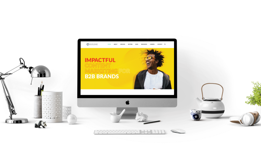
Capturing your audience’s attention is the goal of every tech B2B content marketer. But it’s easier said than done.
Good design can be a game changer in this respect. You might have the highest-quality content, informed by in-depth research, and budget to promote the hell out of it, but if it’s 10 pages of dense copy you run the risk of losing your audience and your message falling flat. Then all the hard work you put in would have been for nothing.
Copy and design, then, must go hand in hand. Integrating the right design can make your content go from zero to hero, and it’s not just anchor content such as white papers that stand to benefit. Blogs, brochures, social media posts, one-pagers, and case studies can all reap the rewards of a slick and sophisticated design to better engage your target audience.In one of the biggest studies of content marketing effectiveness, data and analytics firm Beckon found just 5 percent of all branded content accounts for 90 percent of brand engagement. This highlights just how challenging it is to create standout content – especially for tech B2B content marketing, which can sometimes be perceived as dry and lacklustre. But design can help. Attractive content not only helps engage the reader, but multiple studies show it also helps them to absorb and remember your message. And it can say a lot about the kind of company you are.
Here are five types of visual content that can be very effective for tech brands for sales enablement, thought leadership, awareness building, and more.
Infographics
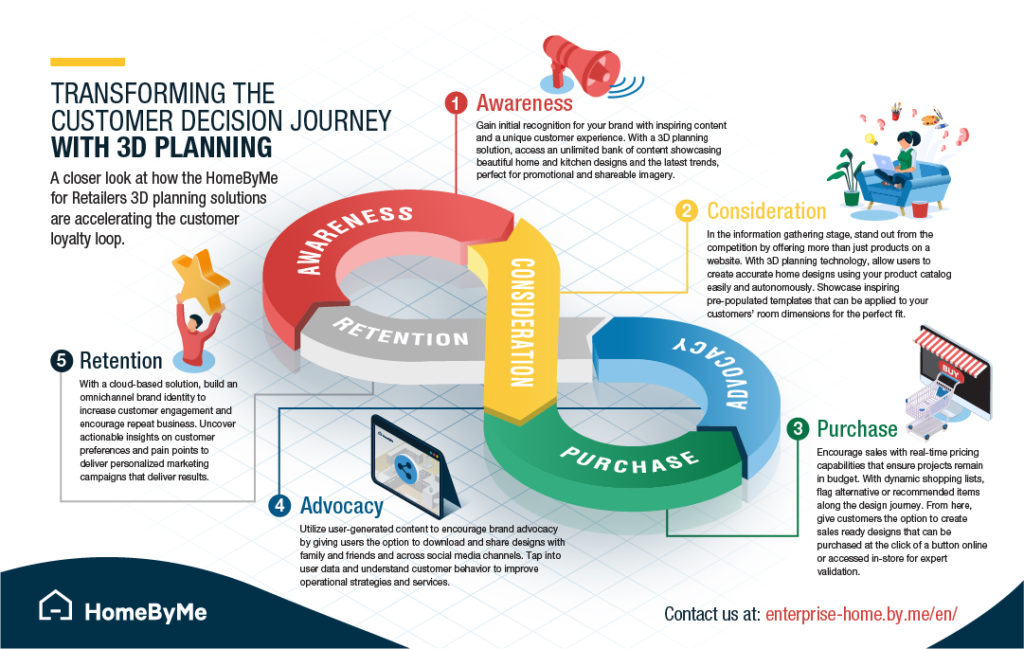
Whether you are presenting research findings or explaining how your product or service meets the market need, infographics can help you present data in a visually-compelling format that encourages reader engagement. If you often find yourself reaching for a pencil to draw out and explain that proposition, an infographic is ideal.
Infographics are also much more sharable, and attract more engagement and peer shares on social media compared to other types of content. Online Infographic maker tools are available, where you don’t need any design skills to make infographics, you just need to customize words and images as per your requirements, can be ready in minutes.
Video
Video format is constantly gaining popularity, but branded videos don’t have to involve huge filming budgets. There’s a wide variety of video formats available out there that are visually effective and cost efficient. For example, animated story-telling is a great way to bring a tech product to life.
The three-minute format means prospects can get a taste of your product or service at a glance, before they move deeper and download a lead magnet asset or case study.
Brochures
Although printed collateral hasn’t made the cut for most content marketing strategies this year due to the lack of events, tradeshows. and general networking because of COVID-19, it’ll likely enjoy a revival once things settle down.
Yes, PDFs have their place, but there’s nothing quite like a high quality, aesthetically pleasing brochure to bring your brand to life in a very tangible way. Particularly for tech start-ups, high-quality printed collateral can reinforce credibility, and build confidence.
Brochure - AdjointBanners
Banners can be used to promote everything from awards and events to new product launches and other types of content such as white papers and case studies. They’re a great visual aid as they only require 10-12 words, a simple image or background, logo, and some sort of CTA or button – this is why they’re perfect for promotion across social media channels. They can even be used in email signatures to further instil brand awareness to email recipients across the company. To create a better user interaction with your logo, make sure to use a professional logo maker which will simplify this task.

Custom graphics
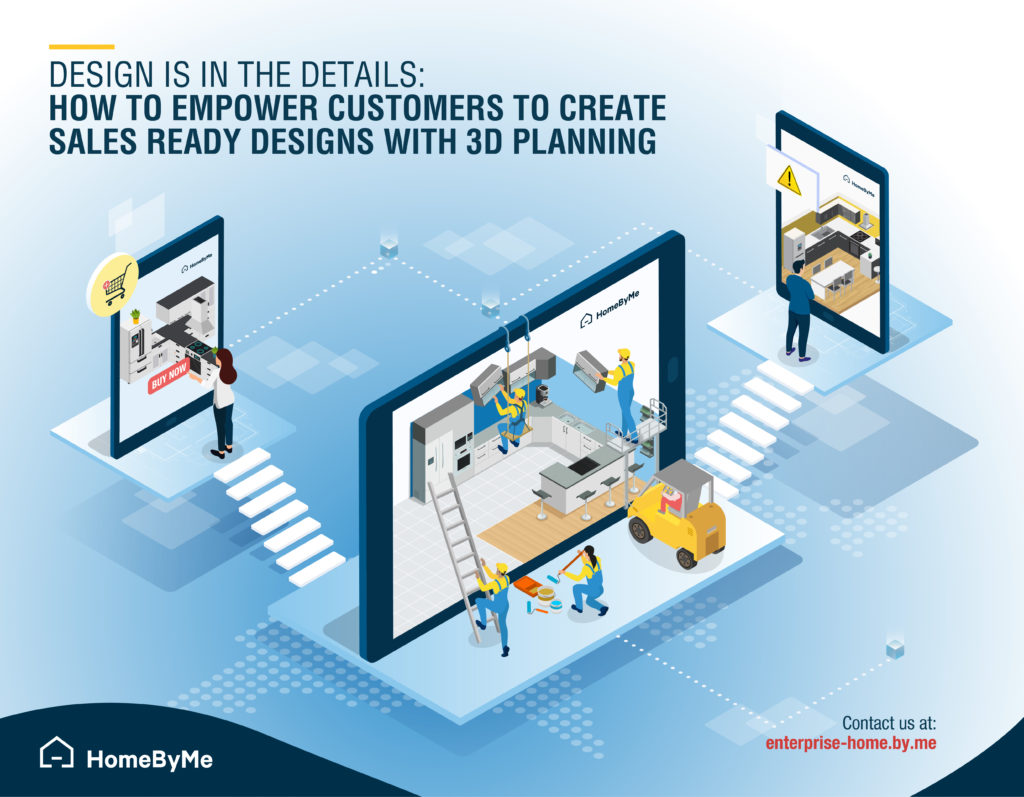
A cross between infographics and banners, custom graphics can be used to convey a brand message, inform people about your company or present quantitative information in a very visual way. A variety of online tools are available to help you create flyers, posters, banners, and many other graphics.
They can be used as blog pre-headers, shared on social media or repurposed for white paper or case study content. Once key difference is that you can’t use a custom graphic on its own, it needs to be used as a pre-header for other more in-depth content.
The main difference between custom graphics and infographics is that the former isn’t as copy heavy. A good rule of thumb: the less written content in a custom graphic, the better.
You might then think that this limits the use cases of a custom graphic, as it would be difficult to show complex concepts. But remember, as content marketers, it’s our job to turn complex ideas, products and services into simple and digestible content that the audience can easily understand. Work directly with the designer to come up with the simplest way to show what you’re trying to convey.
A final piece of advice…
Allow room in your marketing budget for good design. Even if that means creating less overall, but investing in a few pieces of high-quality material. When it comes to effective content marketing, visually-compelling content can often mean more value for your target audiences and ROI for your brand.
Looking to implement a b2b content marketing strategy that includes eye-catching design? Drop us a line at: hello@isolinecomms.com to see how we can help you reach your content goals.
